Dining Room “Looks”
When it comes to the dining room, there are often so many options available … it can feel overwhelming. I find it helpful to start with the feel and the mood. How do you want your dining room to feel? How do you want to feel when you are in there? What tone do you want to set?
You want your dining room to flow comfortably with the overall look and feel of the rest of your house, but often – if you have a dining room that’s somewhat separate – you may have the ability to do something more bold or playful. The dining room is a great place to be a little adventurous!
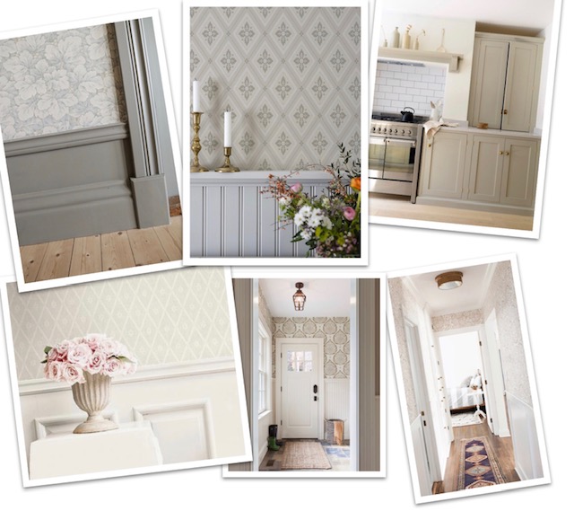
Here are four different dining room “looks” that I recently shared with a client. They knew that they wanted their room to feel warm, inviting and intimate. They wanted it to draw you in and be an area where people would want to linger long after the plates were cleared. Basically, they wanted a restaurant vibe – right in the comfort of their own home. They knew they wanted board + batten so I made sure to include that in each look, while still giving them 4 distinct options.
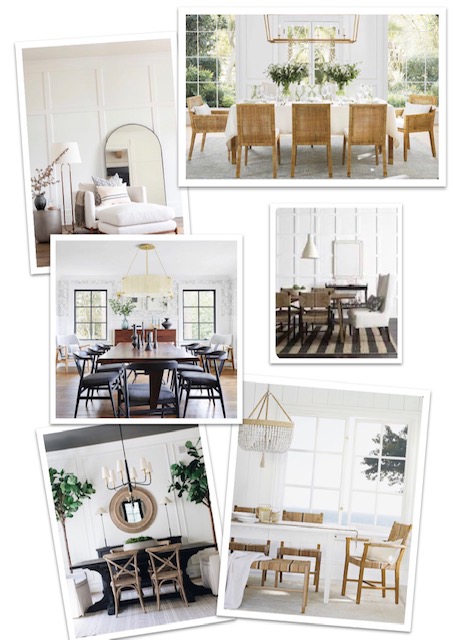
Look 1: All White + Bright and Airy {white walls + white board and batten (likely with different paint finishes to increase variation); bolder lighting + texture to balance all the white}
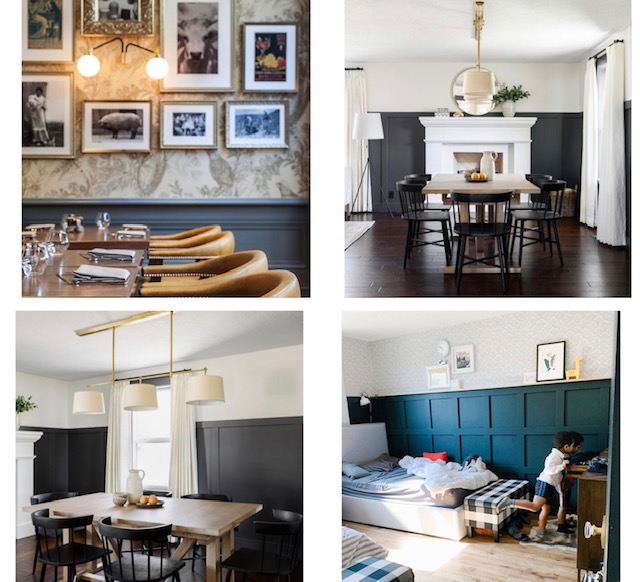
Look 2: Classic + Moody {dark board + batten on the bottom with light or white (paint or wallpaper) on top}
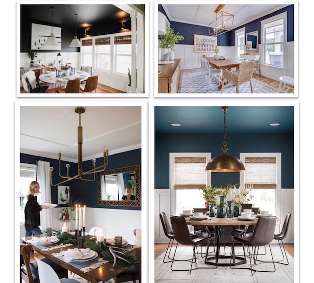
Look 3: Bold + Bright {light board + batten on bottom with dark (paint or wallpaper) on top}
Look 4: Neutral + Natural {monochrome look in a muddy-greige color with paint on the bottom and similar neutral colored wallpaper on top}
They selected Look 2: Classic + Moody. Which look would you choose?

[Images: all images are from Pinterest. I am not able to link directly to and/or list the sources for each specific image.]


