The Trueman Family Dining Room Project
Sweet friends (and loyal/repeat clients) came to me for help and inspiration with their dining room. They wanted a refresh! They wanted their room to feel updated and current, but also intimate and cozy. Not formal, but not too casual. A whole restaurant-quality-date-night-at-home vibe was what they were really hoping to achieve.
I happily dove into this project! I had a LOT of ideas. It was fun to dream it up, sketch it out and bring it to life with them. I really got into this one …
First up. Inspiration. This is where I start. Not only for clients, but for my own home projects as well. I need to feel the whole mood of a space. I need to be able to visualize it. To imagine the end result. This is important when I’m working on my own projects, but it’s crucial when working on client projects. I have to know that we are on the same page and working toward the same end goal. And, so, we start with a little inspiration.
The Truemans weren’t entirely sure what they wanted (and that’s why they came to me in the first place), so I wanted them to be able see and imagine a variety of different looks and options. There were so many different directions we could go. I started with four looks/options …
- All White + Bright and Airy
- Classic + Moody
- Bold + Bright
- Neutral + Natural
Check out a recent article, “Dining Room Looks” to view each option and to see all the inspo (all images are via Pinterest).
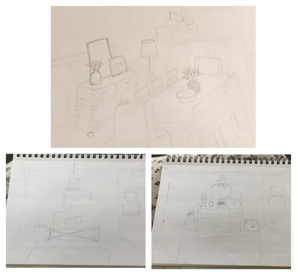
Once they picked a look (Classic + Moody), we had our direction! Next up – sketches! I love this part. It’s really just about getting my ideas on paper. Plus, I feel like it’s key. Once a client has their sketches, they are able to visualize their actual space, which is so important. Then we can tweak them however we need.
Typically I do at least two sketches of each particular area to show how it might look in different ways. Here are a few of the sketches that I did for this particular space …
Next up = board + batten installation, paint color color selection, wallpaper selection, design boards and mood boards! Pretty much – the fun stuff.
One thing that was important to the Truemans (and important to note), was using their existing dining room furniture. This is so relatable, is it not?! It’s not always feasible to replace your dining room furniture. It’s not always feasible to replace ANY furniture. And, that’s SO OKAY. I think it’s important for design to be realistic, relatable, attainable and approachable. Not everything is going to be TV (or even IG) worthy all of the time. The majority of us are just out here living our lives, living IN our homes and living with a budget. There are options and it’s possible to update your home without buying all new everything. Not only is it possible, it should be encouraged and shown more often.
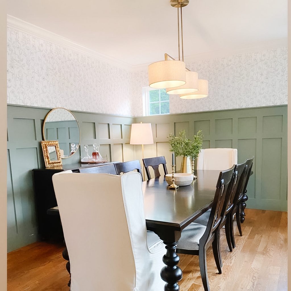
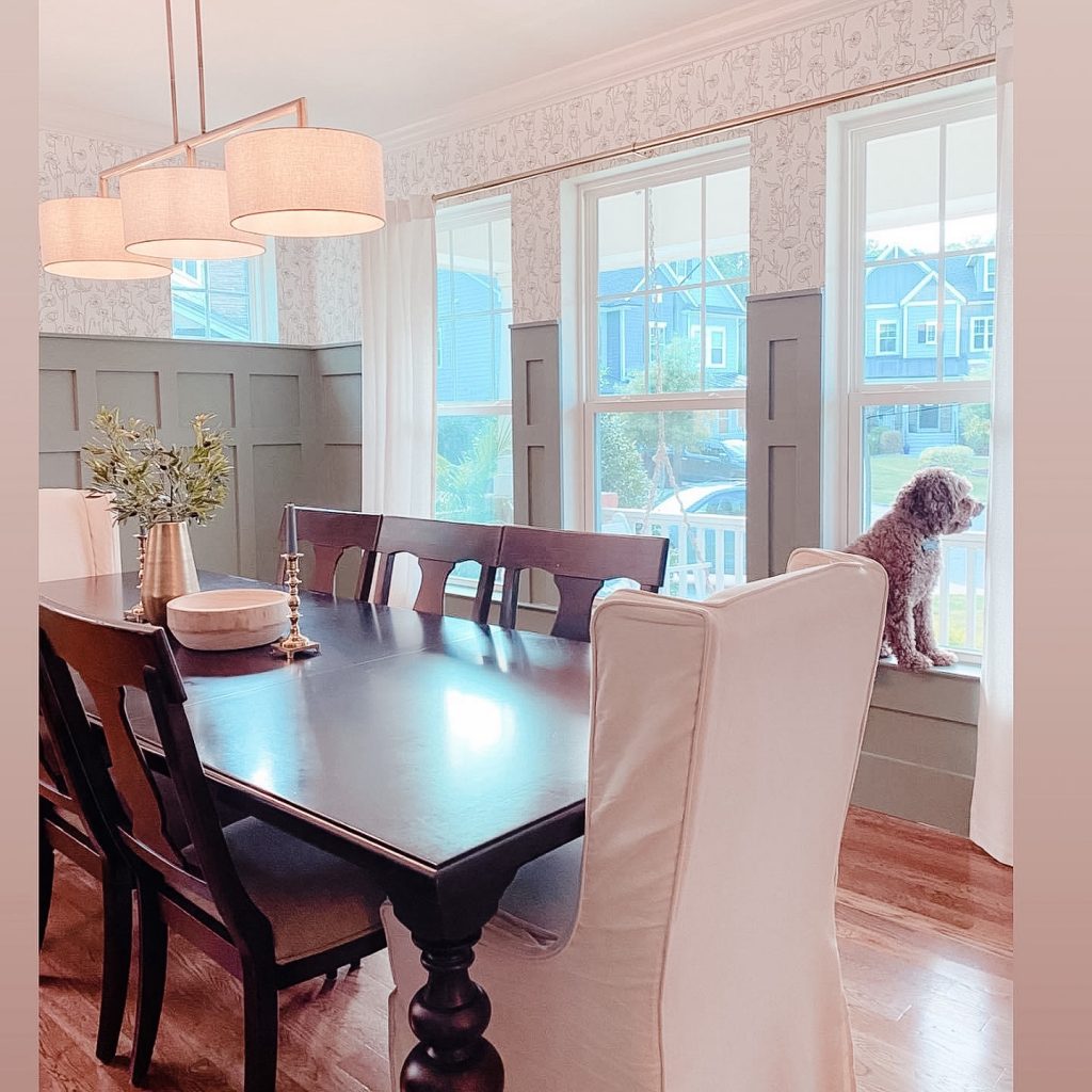
Ta da! The Trueman Dining Room …
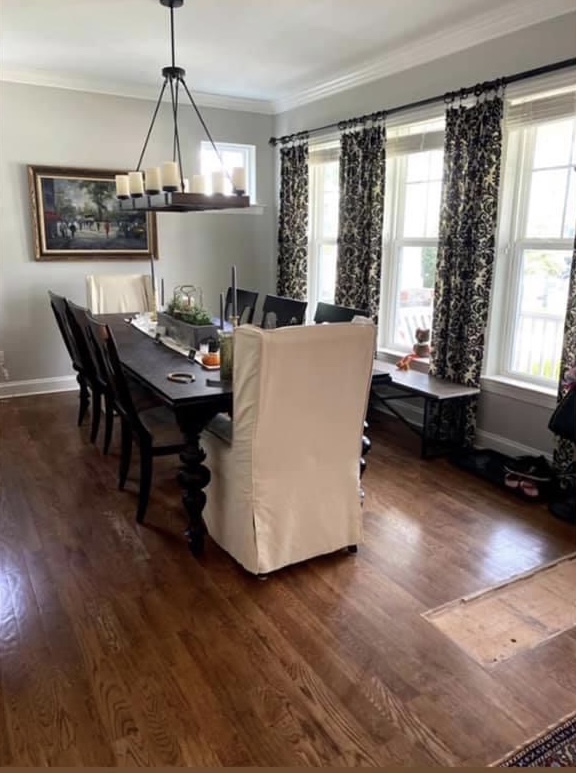
Here’s where we started …
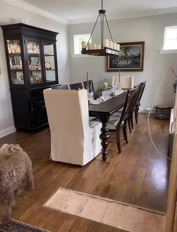
And, here’s where we landed!
We did their foyer/entryway as well, since the two spaces flow into each other and we were able to use her grandmother’s artwork (shown in the “before” dining room pic) in a fresh way. It’s important to use pieces that you love and that mean a lot to you. Give those items a spotlight!
The Trueman’s Dining Room ended up being just what the were hoping for – perfectly cozy and tad a romantic!


